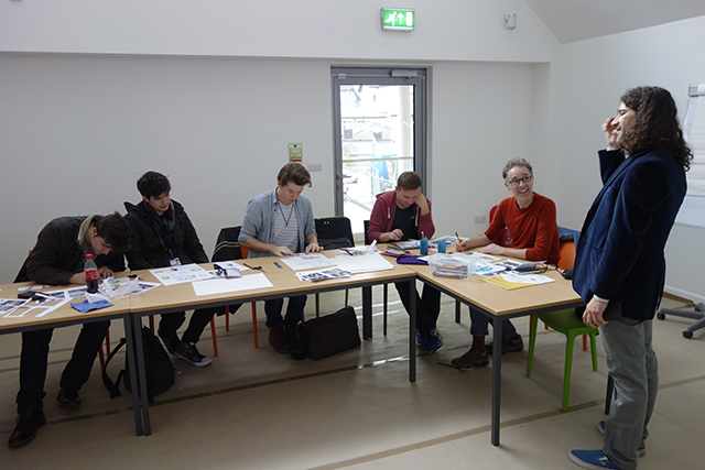
It's been a very busy last two weeks for our first year students as they completed the visual and technical 'assault course' that we call Old School...
Manual skills still underpin much of any working Graphic Designer or Illustrator's life. Think of all that packaging that needs to be mocked-up or presentation boards that need to be professionally assembled.
Say Aaaaaaaaah!
Great Illustration is not only underpinned by an ability to draw well but also by great technical skills. The reality here is there are no 'quick fixes'. It takes years to become a really good painter, or pen & ink artist, or printmaker or...
'Old School' is our opportunity to allow the students to find out how good, bad or ugly their making/drawing/gluing/painting skills actually are right at the start of their course. It helps them identify what they're good at and much more importantly focusses their attention and concentration on working hard to develop those areas that they're not so good at.
Happily, we can report that the overall standard was very good. For a generation who hasn't done any technical drawing or that much painting, we were particularly impressed with their ability to handle constructed letters, draw straight lines, wield a compass accurately, understand the complexities of oblique, isometric and orthographic projection and produce impressive copies of great illustrator's work.
Here's a small selection of what they did...
Create a perfect, 70mm high cube
You're fired!!!
Window mount a postcard.
Use the correct tool (knife) and this can be achieved beautifully (left). Use the wrong tool (hamster) and the results can be a little disappointing (right).
Cut a perfect, freehand circle
(Neil Armstrong walking on my face, Buzz Aldrin walking on my face...)
Two attempts at a stab-stitched book with elaborate graduated hole motif.
One excellent, one not so excellent (can you tell which is which)?
A tidy piece of Orthographic Projection
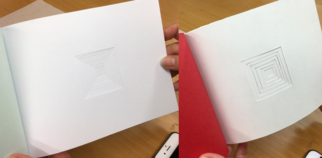
Mmmh, lovely crisp embossing
Stretched paper containing a colour wheel and tonal scales
Exercises for Graphic Design Students
If you follow these instructions you should produce...
...this
Hand-rendered type (pencil on tracing paper)
Original poster (gouache on paper) by Ludwig Hohlwein...
...copies by our students
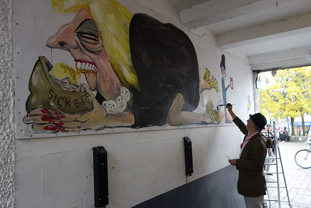
Freehand drawing with a brush
Exercises for Illustration Students
Original by John William Waterhouse...
...student copies
Original woodcut by Clare Leighton...
...Scraperboard copies
And again
Watercolour by Arthur Melville...
 ...and its copy
Original acrylic painting by the great Brad Holland...
...and the copies
After working so hard we gave them the whole weekend off (to recover). Come Monday it was back to work and they are now busy on a two week animation project.


