As you probably know, Dame Rhiannon is a demanding taskmistress with a ruthless, critical eye that can spot the slightest typographic imperfection at more than twenty paces.
Luckily for our novice students she took them through the fundamentals of good typography through a series of lectures, on-screen tutorial sessions and lots of experimental play (see previous post).
This is but the start of a very long journey, but even after such a short time the students can all spot loose tracking, unfortunate apostrophes, orphans, widows and line lengths that are too long or too short.
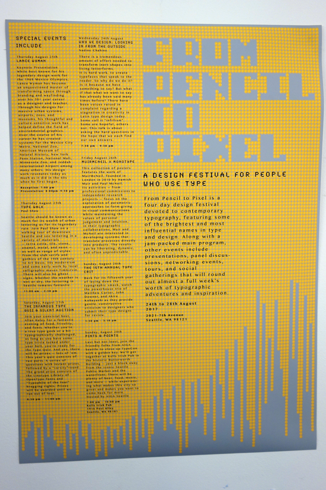
The project was deceptively simple. Take some information about a typography event that looks like this:

...and turn it into something beautiful like this:
Liam (21), Year 1 Graphic Design
Like all our two week projects, we put great emphasis on the journey (the ideas development work) not just the destination (the final poster), so here are lots of examples of what can be achieved during two weeks...
First, let's have a look at some of the results of the type-play workshops:


...and now let's see the final pieces presented on feedback day:
Designed on paper, made beautiful by the Mac...
H.R.H. dispensing words of wisdom
Jim's got his gold sovereign ring tangled in Carrie's hair poor thing!


0 comments:
Post a Comment