blog-header

Wednesday, 11 March 2015

The Shock of the Old (II) - Drawings Featured in Motif Magazine

Motif was an extraordinarily eclectic Art & Design magazine, published from 1958 to 1967. Its production values were incredibly high for the time – exquisite paper stock, elaborate fold-outs, beautiful end-papers etc.

We'd highly recommend the extensive Motif article by Rick Poynor on The Design Observer Group website.

Each issue was a varied mix of architecture, printmaking, painting, drawing, sculpture, graphic design and illustration. 

Grillust lecturers Dwayne Bell and Tony Peart (both 33, both charismatic) have been slowly building their own run of Motif (so far, issues 1,2,3,6,7,9) and students are more than welcome to pop into their office to look through the collection. It must be stressed that the real publication is much more interesting than its digital reproduction (as impressive as they are).

For this post we've decided to look at the drawings featured in Motif. We hope you enjoy them...

MOTIF NO. 1 November 1958 – Cover by Charles Mozley


MOTIF NO. 2 February 1959 – Cover by Robert Stewart


 Robert Stewart

Sheila Robinson 

MOTIF NO. 3 September 1959 – Cover by John Griffiths


A Front of Shops – John Griffiths 


MOTIF NO. 6 Spring 1961 – Cover by Hans Unger


 From Uganda  – Hans Unger

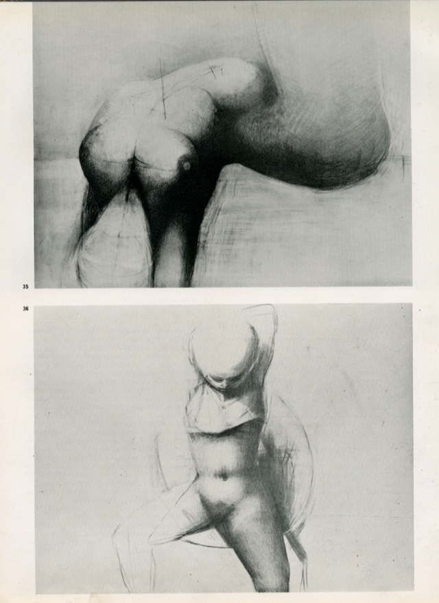
Untitled pencil drawings – Reg Butler 

Life Drawing – Claude Rogers 


Reportage spread – Ian Ribbons 


MOTIF NO. 7 Summer 1961 – Cover by Alan Davie


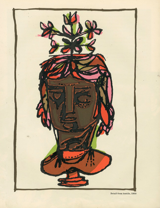
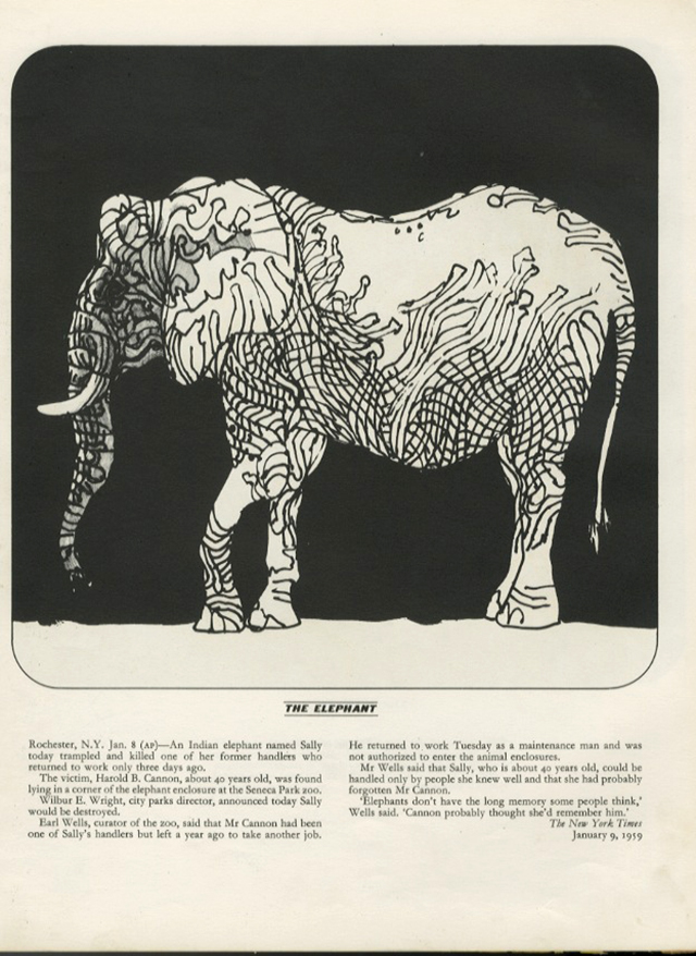
A Bestiary – the great Milton Glaser 


Joseph Low 

Reportage spread – Gerald Downes

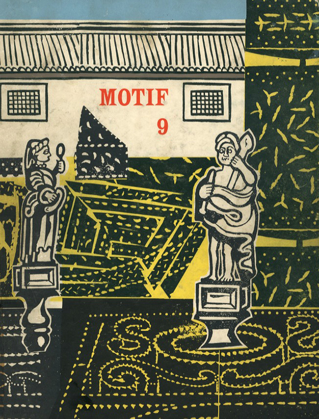
MOTIF NO. 9 Summer 1962 – Cover by Edward Bawden


Peniche – Edward Bawden 

Reportage spread – John Griffiths


Tuesday, 10 March 2015

Workspaces of the Staff and Students (IV)

This week: Illustration Corner!

It's a good long time since we did a 'Workspaces' feature and so to fill the vacuum left by our digital indolence, rather than focus on a particular individual's workspace, we thought we'd take you on safari to those various student habitats found in that area of our studio we call 'Illustration Corner'.

Don't worry, your tour guides know the area well and the natives are friendly. Have a look at the panoramic photograph below to familiarise yourself with the terrain and let the numbers act as signposts, leading you to the interior hinterland and the delights that await you there.

Have fun and remember to keep your legs crossed!

 DETAIL 1


  1. A startled native (Laura, seconds before she darted into the undergrowth)
  2. Arses
  3. Vincent (a graphic designer who lives quite happily in close proximity to a brush* of illustrators)
  4. Sophie (an illustrator and the brush* lookout, pictured emerging from her burrow)
  5. Grillust Hero No. 1 (the late, great John Peel)
*The correct collective noun for a group of illustrators.

 DETAIL 2

The calm before the storm. The ordered tranquility that clearly demonstrates this is the habitat of a graphic designer (in this case Vincent).

  1. Bait box (bait consumed, Vincent won't need to hunt for 48 hours)
  2. Beautifully soft, graphic designer's hands (courtesy Neutrogena Norwegian Formula)
  3. Soothing mood music to work by (Slayer – Seasons in the Abyss)
  4. Grillust Hero No. 2 (the later, greater Andy Warhol)
  5. A warm welcome to visitors

 DETAIL 3

  1. Some of Sophie's illustration work
  2. Dark room/store room/torture chamber
  3. Here be a monster
  4. One of Vincent's many posters for the legendary music venue The Brickyard

 DETAIL 4

Plunging deep into 'illustrator's country' we now reach the back corner, the territory of Jake and Maddy.

  1. Yeah, right...
  2. The Pompidoodle Centre
  3. Maddy's collection of Irn-Bru tartans. Maddy is a real Scotophile and likes nothing better than to hike along the great Scottish valleys. So far, she's enjoyed the delights of Glen Campbell, Glen Close and Glen Miller
  4. Either a green lady's chest or a painting by L S Lowry


 DETAIL 5


  1.  Who doesn't?
  2. Technically this statement is inaccurate as Illustrator's Corner is located in the South-East corner of our studio
  3. A small collection of dead frogs (Vincent's bait...)
  4. 'Bromance' (Jake and Ben)


DETAIL 6


  1. Something glinting tantalisingly in the distance (what could it be?)
  2. Jake's fringe (can be used for camouflage or as a display feature during his elaborate mating rituals)
  3. Maddy's archive of digital council tax letters
  4. Soothing mood music to work by (Rod McKuen – Jean)

Q: So what was glinting so tantalisingly in the distance?


A: 

  1. Maddy's half-eaten Easter Egg (a bit 'previous' as the photo was taken on March 9 2015)
  2. A complementary half-eaten pack of Ryvita (to assuage the guilt we suppose)
Next Time...
We glimpse what tomorrow will look like as we find out what's on Grillust staff member, 'Future' Dave Robert's desk.


Friday, 6 March 2015

The Shock of The Old (an occasional series)

It would be very foolish to think that only illustration and design produced in the last decade was of any interest to students. 

It could be argued (certainly by us) that many of the skills and techniques necessary to produce powerful, individual, memorable design and illustration are rapidly being lost by a generation of undergraduates.

Over the next few weeks we shall be selecting obscure examples from the past that showcase the possibilities of one (or more) aspect of the 'grammar' of design and illustration.

No.1 Dynamic Composition

Design and illustration usually lives in a frame (page, screen, cover, poster etc.) The craft of arranging visual and typographic elements within this frame is called composition.

Compositions can be either either static or dynamic. 

Static compositions create a stable, very ordinary (often boring) aesthetic where elements live in a continually horizontal or vertical world. Dynamic composition is the polar opposite. 

Here the designer/illustrator creates a sense of movement (journey) by carefully taking the viewer's eye around the compositional frame.

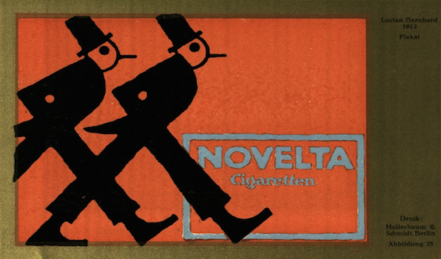
Please have a good look at these examples, all around 100 years old, which come from the German magazine Das Plakat (The Poster) and date to circa 1910–1915!


Wednesday, 4 March 2015

Year 1 Project - Response to Music

We've just finished a two-week project where we asked the students to choose one piece of music from three alternatives, each one very different in terms of style, mood or lyric content.

They were asked to produce a piece of design/illustration based music packaging (CD, LP, 7" Single etc.) or a piece of film/animation.

In all cases the work they produced had to be an 'emotional equivalent' to the music it supported. This was a tough assignment as the students had to empathise fully with the music and then work out exactly what they wanted to communicate to the viewer.

We spent last Friday looking at some very interesting work presented across a wide range of media. Here are some highlights from the day:


Kyle Bridson (Year 1 Illustration) with a 12" gatefold sleeve (in transparent outer slipcase) for Goldfrapp's A&E


Emma Davidson (Year 1 Illustration) with a short animation to accompany Neko Case's Man


Chloe Farsi (Year 1 Graphic Design) with a gatefold sleeve for Deathly by Aimee Mann


Caitlin Quinn (Year 1 Illustration) with a film and animation response to Samuel Barber's Knoxville Summer of 1915
Here's the same track (Knoxville Summer of 1915) interpreted by Leanne Smith (Year 1 Illustration) as a CD sleeve


Sarah Nevison (Year 1 Graphic Design) made a film to accompany Meyer by The Neil Crowley Trio


Tuesday, 3 March 2015

indesign for issuu

Issuu is an online facility that allows you to upload and browse pdfs in the form of book / magazine. Creating a pdf ‘book’ to upload to issuu, couldn’t be easier. We’ll use InDesign to create a multi-page pdf. Don’t worry if you’ve never used indesign or even heard of it. We’ll use it in the most rudimentary way possible – you’ll receive much more informative and in-depth inductions and schooling later, from people who’s Geekus Callosum (the part of the brain that deals with Macs, software and the like) are hugely engorged and stuffed full of info.
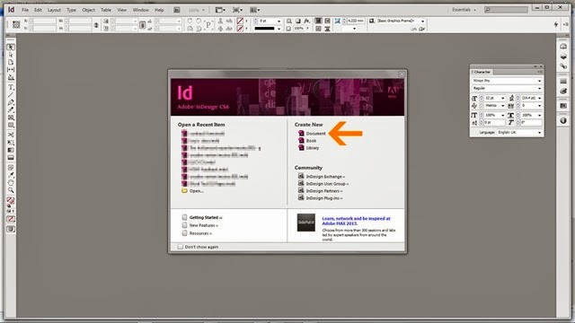
101Open InDesign. From the start up options select ‘Document’. If you accidentally close this window before selecting, stop crying and go to File>New>Document
202From the options, select Facing pages. This will allow you to view your design in a book format.
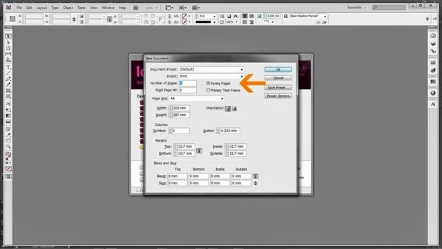
305Enter the number of pages you want (remember, the first and last will be covers). You can easily amend this later. In fact, I’m not sure why they bother asking you now.
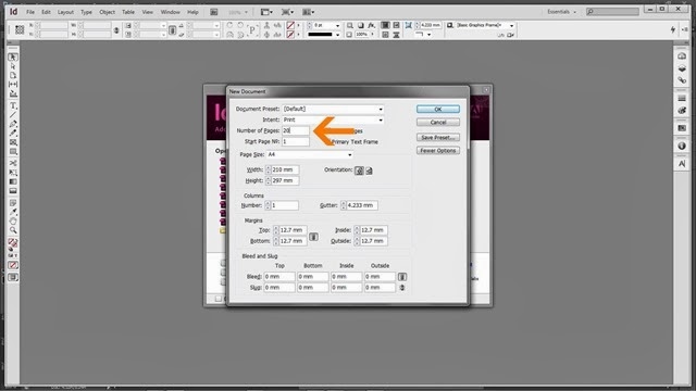
406This is the part where you pick the size and orientation of your document. The size you enter is for a single page so a spread will be twice the width.
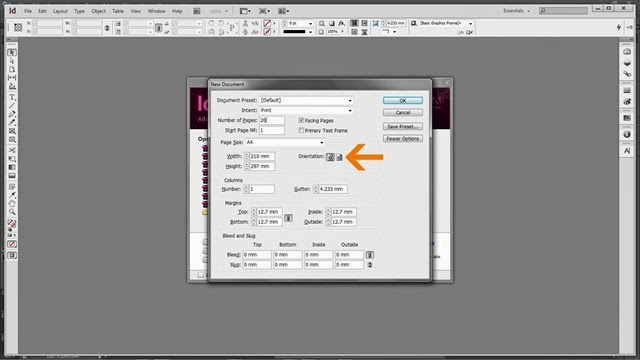
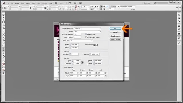
507With facing pages selected, page number selected, the correct sizes entered, the correct orientation entered hit OK.
608Now you’re looking at a blank document. A cover, several blank spreads and a back cover.
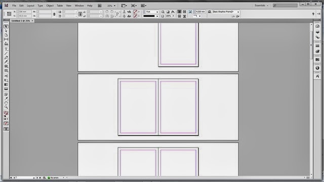
InDesign has a approximately a millionbillion options, buttons, and things. You don’t need to worry about nearly all of them.
709
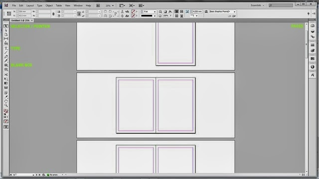
Selector / Pointer (black arrow at top of tool bar). It probably has a proper name. Use this for selecting items (picture boxes, type boxes etc). It’s your general ‘go to guy’.
Type (T). Select this when you want to create type in InDesign. When selected, drag cursor to create a box in which to put type.
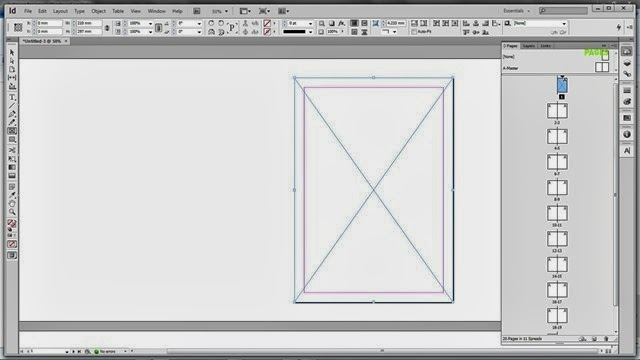
Blank Box (rectangle with cross through it). When selected, drag cursor to create a box in which to put items like images – saved else where.
Pages. Select this (also available Windows>Pages) to view info on the pages / layout. The selected page displays in blue. Note. The page you’re looking at on the main workspace isn’t always the page that’s selected.
Like most Adobe programmes, the bar along the top of the workspace is dependent on the tool you have selected. Options for each tool will display here. For example when Type tool is selected, font, weight and other options will show here.
8 – adding an image11
Select the blank box tool (again it probably has a proper name).
Drag a box in which you want to place an image. In this instance I’m putting a full page image on the cover.
912
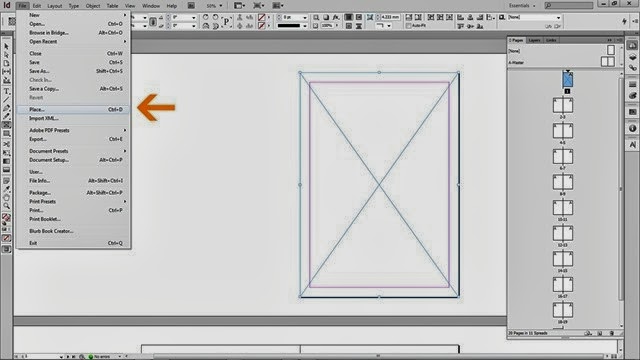
File>Place (or command D) will open a dialogue box, locate and select the image you want to place (must be on the machine you are using or on an inserted hard drive). Once placed, right click (CTRL click on single button Mac)
1013When you right you will get this menu, look for and pass over ‘Fitting’. The options here tell the box how you want the content to fit. The options are fairly self explanatory but in this case I want it to ‘Fit Content Proportionally’.
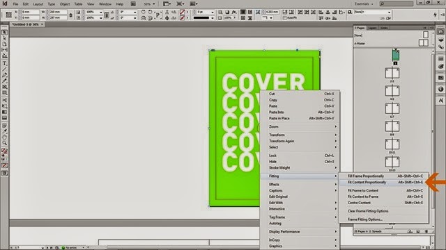
1119 In this way you can fill your book with content. You can design this content in photoshop. You can create it by hand and scan it in. You can use photographs directly. Essentially, the above image should represent what you have when you’re finished. Now we have to export the document as a pdf for issuu
1220. To export got to File>Export. There are two kinds of pdf. They’re slightly different but both work fine. If you want to add hyperlinks in your document (type that links to websites, email accounts) you want interactive. If not, print. You will also have to give a location for your pdf to be saved to. Click Save.
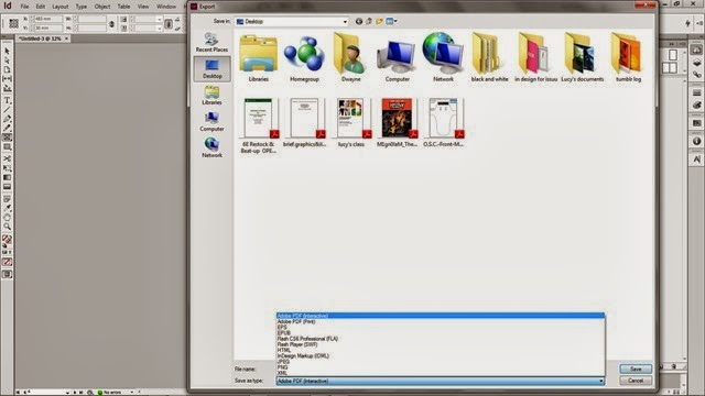
1321Then you get this. A variety of options that dictate how your pdf is created. The most important one is pages. You must select pages. If you select Spreads then it will all go pear shaped in issuu.
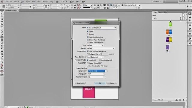
Once you hit OK your pdf will be generated and saved to the location you specified, ready to be uploaded to issuu. Which is a whole other story!