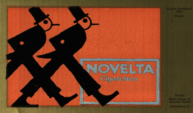
It could be argued (certainly by us) that many of the skills and techniques necessary to produce powerful, individual, memorable design and illustration are rapidly being lost by a generation of undergraduates.
Over the next few weeks we shall be selecting obscure examples from the past that showcase the possibilities of one (or more) aspect of the 'grammar' of design and illustration.
No.1 Dynamic Composition
Design and illustration usually lives in a frame (page, screen, cover, poster etc.) The craft of arranging visual and typographic elements within this frame is called composition.
Compositions can be either either static or dynamic.
Static compositions create a stable, very ordinary (often boring) aesthetic where elements live in a continually horizontal or vertical world. Dynamic composition is the polar opposite.
Here the designer/illustrator creates a sense of movement (journey) by carefully taking the viewer's eye around the compositional frame.
Please have a good look at these examples, all around 100 years old, which come from the German magazine Das Plakat (The Poster) and date to circa 1910–1915!


Graphic designing is very diverse and interesting field, which gives you a chance to play with your creativity in unique way. Logo is an identity of any product so logo design of any product or company matters a lot.
ReplyDelete