Why?
Well, put simply, visuals remain the currency of the design profession. Quick sketches are how we communicate our ideas to one another – no one can see the images in your head! However, once things are down on paper a conversation can take place. Potential can be assessed, alternatives can be rehearsed, advice can be given...
The bulk of 'the design process' takes place at this early stage, in fact the creation of final artwork is often the least interesting or satisfying part of the process. It's your ability to generate ideas (and visualise them in a meaningful way) that get's you noticed in the world of design and illustration.
Hasn't the computer now replaced pencil, pen, brush and paper? In terms of ideas generation the answer remains a firm no. You see, in the professional workplace, time is money and if it takes 60 seconds to make a drawn visual as opposed to 5 minutes on a Mac then drawing will always emerge victorious.
So what constitutes a good visual?
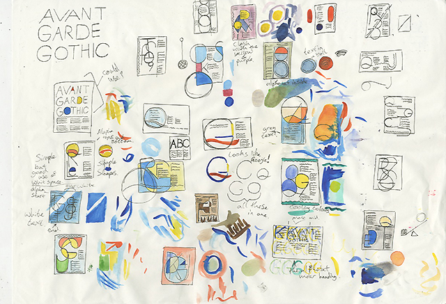
A good visual is a quickly realised, accurate representation of your intentions. If your final design is to be in full colour your visuals should be too. Think of them as mini versions of your final design or illustration. Although always lacking the smaller details all of the major elements should be there (composition, grid structures, type alignments, colour, display fonts etc.).
Here are some 'good' Year 1 visuals from a recent typography project (full post to follow).
Have a good look at them to see what we mean.


James Wilding (21)
Chloe Farsi (21)
Josh Lindley (21)
Harry Willmott (21)
Emma Wrigley (21)


0 comments:
Post a Comment