blog-header

Friday, 18 December 2015

Merry Christmas Everyone!


It's been an 'interesting' run up to Christmas here in Carlisle with some unforgettable weather of biblical proportions. Happily, as our campus is built high on a hill overlooking the River Eden, we never flood.

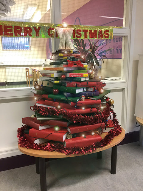
As life here returns to normal, we thought we'd share our wonderful campus librarian's creative (and resourceful) approach to the traditional tree and at the same time, wish everyone involved with the Grillust empire a very Happy Christmas and a Peaceful New Year.

You will be happy to know that only books relating to Christmas were used in its making (e.g. A Christmas Carol, The Nightmare Before Christmas, It's a Wonderful Life [screenplay], Delia Smith's Christmas, How the Grinch Stole Christmas, Mr Blobby's Big Book of Festive Fun etc, etc.)

First Years, Fifth Project - How Stuff Works

You can't produce a piece of design (or illustration) for something you don't understand. 

Design and Illustration are both complex subjects, but at their heart lies one constant question that has to be answered:

What are we trying to communicate?

To achieve the level of understanding necessary to have something to say, we need to undertake very thorough research.

Usually, if the research has been fruitful, the actual structure of the design falls quite easily into place. There will probably be an obvious sequence that needs to be followed.

This is what this project was about - take a subject the students don't know anything about, set them to thoroughly research it and then ask them to design a digital publication that explains how the thing works in seven, double-page steps.

It couldn't be easier.

Here's what thorough research and good design development looks like (courtesy of Emma and Tabitha who had to explain how ancient civilizations knew that the earth was a sphere):


Here's the final digital publication followed by a selection of other student's work:


Monday, 14 December 2015

First Years, Fourth Project - Drawing with Understanding

Here's the project that immediately followed animation, two weeks devoted to drawing.

We believe that all our students should be confident image makers. That could be illustrators producing convincing, complex artwork or graphic designers producing a quick, plausable sketch for a sheet of packaging visuals.

Underpinning any ability to draw has to be a thorough understanding of what the artist/designer is actually seeing.

Perspective, in particular, helps explain what we see in that wonderfully complicated three dimensional world that surrounds us...

Here's a quick overview of some of the work produced by both Illustration and Graphic Design Students (including Olivia Foxton, Tabitha Walby, Rebecca Graham, Hazel Mason and Sian Whitfield...)


Tuesday, 1 December 2015

First Years, Third Project - Animation

Here's a small selection of work produced by our plucky first year students during a two week, intensive introduction to the wonderful world of creative animation.

The first week was all about getting ideas down on paper (storyboarding) with the final, 30 second animations being produced during week two.

Tabitha and Alex produced a very 'dark' piece of vegetable torture (an aubergine is a vegetable isn't it)?


The storyboard


Production shots


The Final Piece


Emma and Jenny looked at a non-cooperative artists' figure...


Ali and Ludia...


A further selection of storyboards...


...and more final animations.


Thursday, 19 November 2015

The Penny Library of Room 2017
Mick McMahon's return to Dredd (1995)

I've mentioned Mick McMahon on here before. I make no apologies. I'm a fan.
McMahon was the artist who first introduced Judge Dredd to the world back in 1977 (2000ad, issue #2). In 1981 he quit drawing Dredd. Too many crowd scenes, apparently. In 1995 he made a slight return with the 4 part mini series "Howler" for the (embarrassingly titled) Megazine. At the time I was 17 and a comic buying super fan. The comics still live in my mother's attic. Yesterday I climbed up and recovered "Howler".


McMahon's work for Howler, typifies a new era of McMahon's work. Flat colour, angular poses and lines. Striking compositions and abstracted form. Other comics with a similar approach include The Last American and Tattered Banners. Both worth hunting down.


I'd love to say I was a fan of this style at the time but alas the teenage me was lacking the sophistication/sense to appreciate this way of working and, like many other people, I wasn't a fan. I didn't appreciate the stylistic development and wanted a return to his more traditional, black ink fills. (Now it's the fact that he was determined to develop that I find so laudable).


In hindsight, the teenage me was a dumb-ass and over the last few years I've found myself transfixed with this work and all of it's qualities. I particularly like that it's not macho. It's not all bulging muscles and cleavages. It doesn't really reference the world of comics of the 90's. Looking through these old issues now, McMahon's work stands out a mile and whilst most of the other art embarrasses the grown-up-me, this definitely doesn't. It's stood the test of time, and then some.


Eye popping compositions and exaggerated body language get the point across with a staccato rhythm whilst guaranteeing that the story never gets boring.


Single frames stand up, on their own. Look at the lines, compositions, colours, rhythm.


Mick McMahon, once again, we salute you.

p.s - Mick, why have you shut your blog down?

Monday, 16 November 2015

Inclement Weather

Cycled to Uni today but probably should have come by canoe...


The work of Keith Negley


American illustrator Keith Negley is currently riding high on a wave of success and recognition - for good reason. As well as his recently released children's book 'Tough Guys (Have Feelings Too)' he's kept busy with regular editorial work for the likes of The New York Times and exhibiting his work.
Illustration blog 'inky goodness' have posted an educational, inspirational and revealing interview with the artist that should make interesting reading to illustration and graphic design students alike.


Tuesday, 10 November 2015

First Years, Second Project - Old School!

It's been a very busy last couple of weeks for our first year students as they completed the visual and technical 'assault course' that we call Old School...

Manual skills still underpin much of any working Graphic Designers life. Think of all that packaging that needs to be mocked-up or presentation boards that need to be professionally assembled. 

Great Illustration is not only underpinned by an ability to draw well but also by great technical skills. The reality here is there are no 'quick fixes'. It takes years to become a really good painter, or pen & ink artist, or printmaker or...

'Old School' is our opportunity to allow the students to find out how good, bad or ugly their making/drawing/gluing/painting skills actually are right at the start of their course. It helps them identify what they're good at and much more importantly focusses their attention and concentration on working hard to develop those areas that they're not so good at.

Happily, we can report that the overall standard was very good. For a generation who hasn't done any technical drawing or that much painting, we were particularly impressed with their ability to handle constructed letters, draw straight lines, wield a compass accurately, understand the complexities of oblique, isometric and orthographic projection and produce impressive copies of great illustrator's work.

What follows is the specific task closely followed by images of the work the students created...