blog-header

Sunday 24 February 2013

The shadow that looks quite like Tony Iommi (from off of/out of Black Sabbath)

When charismatic photography lecturer (and Frankie Stubbs out of Leatherface looky-likey) Dr John Darwell (33) told us he had photographed a shadow on his living room wall that looked suspiciously like Black Sabbath’s demonic axe wielder, Tony Iommi, our curiosity was understandably piqued.
Dr John, duly supplied us with his snap (below) which I’m sure you’ll agree it does indeed look like the iconic metal guitarist.
Tony


It’s strange that a vision from the universe of Heavy Metal should reveal itself to a man so immersed in the alternate musical dimension of Hardcore Punk Rock. In fact John lives his life according to the gospel of Hardcore; starting each day with a filling bowl of Fugazi topped with a few Husker Du’s (he says it stops him getting Bad Brains) and ceremonially hoisting a Black Flag above his house, before setting off to work.

We should also add that phantasmagorical apparitions are nothing new to the Grillust™ team.
You may remember the ink stain, in the shape of ZZ Top’s Billy Gibbons (pictured below) that we featured some time ago.
Billy


Grillust™ operative Tony Peart (33) also tells us that he regularly sees the face of Jesus Christ in QR Codes! See the picture below.
Jesus

Friday 22 February 2013

That difficult second album


IT'S HERE!!!

Yes! Ever since Grillust™ released the seminal Upperby Road, dedicated fans worldwide have been crying out for a follow-up release.

Now everyone 'in the business' knows that the second album can be difficult, but Grillust™ aficionados will not be surprised that, not only are we up to the game, but we've raised the bar with a concept album that positions us firmly amongst British rock legends like Supertramp and Racey
Inspired by our ongoing 'band names' feature, we proudly present a 12" vinyl tribute to their potential. Over 60 minutes of absolute silence with no reference to John Cage's 4' 33"of the stuff. The lightweight!
Now That's What I Call Grillust™ ©AppleCrumble Records 2013
Pop this long player on your turntable and hum along to what might be a classic album if any of the bands actually come to fruition.

The MP3 download will be available in time for Christmas.


Specific Gravity and the Fez

This week 2nd Year graphic design students have teamed up with their BA Photography counterparts to begin the design and production of photographic books.

Grillust™ operative, Jim (33), was almost sick with excitement when he heard that Dr John would be attending the briefing. Imagine his disappointment when he found out it was only our own Dr John Darwell (33), merely a photography lecturer and not an international jazz/blues personality.

A thorough project briefing requires the use of a Fez. You heard it here first.
Normally we'd pair up students using the internationally understood 'playground football team selection rules', but as we had a Fez we opted for the preferred alternative. The well-drilled graphics students had no difficulty in arranging themselves by height as required by the rules but, again, the photographers made a right hash of lining up in alphabetical order despite their firm assertion that "we can do this!".

Dr John (being an academic Dr) whipped out his slide rule and worked out that this is because the photography students are a lighter specific gravity than graphics students – one graphics student is equal to 1.95 photography students. Paradoxically, they are not as dense as graphic design students on an atomic level, allowing both common sense and alphabetical prowess to leak out all over the place.

Dr John Darwell (right) is congratulated on his discovery of the student specific gravity factor (SSG)
A quick game of British Bulldogs soon had the students divided into the exact ratio 1 to 1.95,  and they quickly set about sizing each other up for the task ahead.


Watch this space for the results.


An open letter to all of Advertising and Marketing


This has been blogged by our friends at Sell! Sell! (coincidentally where our graduates Ryan Young and Lee Freeman exercise their creative muscle).

Grillust™ agree entirely with the underlying message in this letter – that being the indisputable fact that marketing (as opposed to the noble profession of design) is an entirely greasy trade populated by the unimaginative and politically-correct. "MARK£T££Rs" (made up name, they're good at that), tooled-up with only smoke and mirrors, busy themselves with product profiles, mission statements, consumer focus groups and so on 'ad infinitum', until they have enough graphs, diagrams, core statements, trend reports to bore the jiggley-bits off a statue and promote bland, grey, homogeneous design in the hope that they will not offend anyone (see point 5 below). This plays right into the hands of timid managers who are really looking for someone to blame when it all goes wrong.

How to spot a "MARK£T££R" for Dummies

1. Endlessly and unnecessarily enthusiastic about a totally insignificant details (like 'strap lines', which if not corralled and dispatched at an early stage will become the entire 'focus' of all future marketing effort...

...until the next 'Mark£ting Consultant' has a go.

2. Endless and unnecessarily enthusiastic use of the 'language of Mark£ting'; a series of made-up words that have no real meaning, in order to make themselves seem interesting and dynamic.

3. Endlessly and unnecessarily enthusiastic about what everyone has to say in their endless meetings. Even if it's a naff idea you'll still be required to 'take it onboard'

4. Endlessly and unnecessarily deferential to their line managers – anything to avoid the question, 'what exactly is it that you do?'.

5. Endlessly and unnecessarily desperate to be 'in with the crowd'. Like Wildebeest, MARK£T££Rs like to be in the centre of things - it's harder to be picked off by the predators if you're in the centre.

In the 'Working Lives' spotlight next week; Staff Development Officers

Thursday 21 February 2013

The Human test


83% of Grillust-ites passed.

Wednesday 20 February 2013

Scenes from the Life Room (and just outside it)


Thursday 14 February 2013

Cox in Computer Arts

jenny cox computer artsjenny cox computer arts close-upjenny cox computer arts page

Her again. We just noticed that Jen has been featured in Computer Arts. She’s blogged it and we’re blogging it too.

Ex student says nice words

And no bribe was issued. Jenny Cox, recently graduated and set loose upon the world is currently featured on ‘Design Juices’ and had these nice words to say about her time here at Grillust Towers…

“The UOC Graphic Design and Illustration course was astounding, more like an apprenticeship than a uni course, they really cracked the whip and taught us everything we need to be top-notch designers and visual communicators.”

The full, frank and revealing interview can be found here

Here’s a couple of pieces of Jenny’s work to wrap your eyes around

Stamp Piece web Illustration Jenny CoxStamp text piece web Illustration Jenny CoxJCox-Velvet-necklace-web

Friday 8 February 2013

A song for Friday


Young men of today, you could all learn something about the deportment of a real man from this video AND it's funky!
 

Cheltenham illustration awards 2013

index2_call13_r1_c1index2_call13_r5_c8

Details of this years Cheltenham Illustration Awards are now live - here.
We were pleased to see this entry show up in the highlights of last years student entrants…

LouiseHubbard108

Louise Hubbard, recent Grillust graduate (try saying that fast) created and entered this atmospheric and dramatic piece. Well done to her for being selected.

Monday 4 February 2013

Title Sequences

We briefed the first year students this morning for a two week, film/TV title sequence project.

During this time, they'll be learning to use Adobe After Effects and producing a 10-30 second title sequence for a programme or film synopsis, taken from Charlie Brooker's excellent TV Go Home Radio Times spoof site (N.B. don't click if rude words aren't your thing).

During the briefing we showed lots of excellent sequences including these:


The Life Room (Episode 2)

In last week's gripping episode we experienced the tension, jockeying for position and psychological mind games that underpin any life drawing class.

This week things got dirty...

The evil Lady Sophie: who lives at the Manor House; drives a Range Rover and is obsessed with Moben kitchens (pictured below)...


...discovered that Lottie had a skeleton in her cupboard...

... and threatening to expose Lottie's secret to the Police, forced the unfortunate illustrator into slavery in the depths of the family charcoal mine (pictured below).


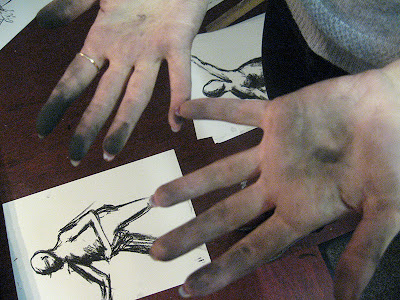
Meanwhile: undercover, special operations agent Edwin, noticing the state of Lottie's hands (and face), commenced some investigations of his own (pictured below).


Elsewhere, budding expressionist Callum accidentally clashed elbows with Lucy (photo below). Lucy doesn't "stand for any nonsense" and was vexed by this invasion of her personal space. So vexed in fact that she engaged a hit-man (Ross Kemp) to 'fix' Callum.


Lucy's asked Ross to make it "look like an accident" by simply toppling an easel over onto the enthusiastic student. However, Ross decided he knew better and went after Calum with a sword (pictured below)!


This outrageous attack, in public (and naked as the day he was born) could hardly pass unnoticed and indeed, most observers could produce witness drawings of what they had seen....


.... except for Graphic design student Christie who now finds it difficult to sleep, haunted as she is by this image of a confused-looking, rampaging Ross Kemp.


Next Week: The curse of the Quink Ink!


Year 1 Hardcore Typography - The Results

You'll remember that the first years have been working alongside our very own Rhiannon (H.R.H. The Typographer Royal) Robinson (33) and as promised earlier, here are some of the results of two weeks of highly intensive, typographic training.
 

The Brief was split into two parts...
 

Part One: Play with the visual possibilities of two contrasting typefaces and create a range of images made from type.
 

Part Two: Produce two promotional A3 posters to promote the typefaces. One in black and white, the other in colour, each using one of the type images created in Part 1.

 
Adam Reid (21)


Jessica Julien (21)


Lewis Gray (21)


Derrian Bradder (21)


Reece Crowder (21)


Reece Crowder (21)


Lucy Hadley (21)


Lewis Gray (21)


Jake Clarke (21)


Jake Clarke (21)

 
Aimee Stewart (21)

mixing up some type?

With the first years coming to the end of their time with The Queen of Type, The Grande Dame of all things font  – Rhiannon – they surely won’t be in need of the pointers in this online tutorial. For those who don’t have the benefit of our Lady of the Letterform’s years of experience and expertise, there are suggestions and tips here that might come in handy.