blog-header

Thursday 26 March 2015

It's Official, We're Healthy!

Carlisle (left) and Preston (right) yesterday...

We always thought Carlisle was a healthier place than Preston but now it's been officially proven.

Read on...


Tuesday 24 March 2015

and now for something completely different...


Monday 23 March 2015

The Shock of the Old (IV) - Logos and Marks from Das Plakat C.1905

Q: How did people design logos before computers?

A: Very well indeed, as these examples (all over 100 years old) will demonstrate...


Friday 20 March 2015

Incoming!


BREAKING NEWS...
Although tensions have been running a little high in the studio following the recent disappearance of a pack of Revels from someone's desk, nothing quite prepared us for this vicious and totally unprovoked intercontinental ballistic pen attack on innocent student Elinor Prescott (21).

The identity of the 'evil genius' perpetrator (Jam*s Wildi*g) shall remain shrouded in secrecy.

UN Peacekeepers have now arrived and things have calmed down a bit...


We Done Seen an Eclipse!

The skys were grey, the prospects looked dim, but then...

...the clouds suddenly thinned and with our own naked eyes (no need for welder's goggles or pinhole cameras round here) we saw this magnificent sight:

Photo courtesy Mr. Thomas Selwood (21)

Wednesday 18 March 2015

year 1 Photo Experiment Books
Thinking Through Image Making

As part of the twelve week, rolling programme of short projects that is 'Thinking Through Image Making', Yr1 graphic designers recently completed an issuu publication of photographs (whilst illustrators were off drawing people in the nip). The photos were taken in accordance with two rules which they each randomly selected and then manipulated in photoshop.
Here's a random selection of results.


Will fuller


Abigail Wilding-Armstrong


Sarah Nevison


Kyle Bridson


Tom selwood

The Shock of The Old (III)
You Will Live Under the Sea

Right in the middle of the twentieth century (after World War II but before East17) graphic design and illustration was in a very happy place. Experimentation and creativity were the order of the day. There's a seemingly endless list of illustrators (usually American) who in the 50's and 60's, were producing work that remains to this day, eye poppingly brilliant. Step forward Ward Brackett.

Ward Brackett began his illustration career in the 1930's and by the 50's he was producing editorial paintings for the likes of 'Good Housekeeping' - usually to accompany the sort short stories that magazines don't carry any more.

Ward Brackett for Good Housekeeping 1948

By the 60's Brackett, was exploring a very different way of working (whilst maintaing the highly wrought, painterly approach) that has been described as 'sophisticated crudeness'. This style is a mixed media playground where collage and gestural mark making come together in a playful and exciting visual world.


Some examples of Ward Brackett's multi media, 'sophisticatedly crude' work.

Brackett, created several childrens' books in this way and it's one of those that we're going to show off.
Bought recently from a library in Indiana (via Amazon) You Will Live Under the Sea, is a 1966 children's book about mans future beneath the waves, illustrated by Ward Brackett in his alternate, collaged, sophisticatedly crude style.


On closer inspection the collage and textural nature of the illustration process is evident.


Remember, all of this work was created decades before photoshop. I expect to see you all jostling for the photocopier over the coming weeks.

First Years Do Hardcore Typography

Our first year students have just spent a challenging and fruitful two weeks working alongside our 'national treasure', H.R.H The Typographer Royal, Dame Rhiannon Robinson OBT*.


As you probably know, Dame Rhiannon is a demanding taskmistress with a ruthless, critical eye that can spot the slightest typographic imperfection at more than twenty paces.


Luckily for our novice students she took them through the fundamentals of good typography through a series of lectures and on-screen tutorial sessions.


This is but the start of a very long journey, but even after such a short time the students can all spot loose tracking, unfortunate apostrophes, orphans, widows and line lengths that are too long or too short.


The project was deceptively simple. Take some information about a typeface like this:

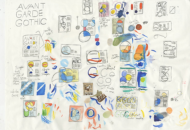
...and turn it into a visual striking and readable A3 poster like this:


Miss Danielle Jaiyeola (21)


Here's a survey of some of the best:


Master James Wilding (21)


The Rt Hon. Thomas Selwood (21)


Ms. Emma Davidson (21)


Miss Danielle Jaiyeola (again)


Kyle Bridson Esq. (21)


Mistress Rebecca Lettice (21)


The Hon. Marisa Devonshire (21)


Dame Chloe Farsi (21)


Princess Harriet Easterbrook (21)


Dame Chloe Farsi (again)


*OBT = Order of British Typography

If a Tree Falls Over and There's No One There To...

Cycling to work today Grillust operative Tony Peart (33) came across this sad sight:


It put him in mind of Daniel Eatock's excellent Vandalized Trees Reoriented project (some examples shown below)


So without further ado, here's our fallen tree reorientated into something approaching its former glory...

Monday 16 March 2015

First Year Visuals

The ability to produce 'thumbnail visuals' (sometimes called 'roughs' or 'scamps') is an absolutely crucial skill that any successful design or illustration students will have to master.  

Why?

Well, put simply, visuals remain the currency of the design profession. Quick sketches are how we communicate our ideas to one another – no one can see the images in your head! However, once things are down on paper a conversation can take place. Potential can be assessed, alternatives can be rehearsed, advice can be given...

The bulk of 'the design process' takes place at this early stage, in fact the creation of final artwork is often the least interesting or satisfying part of the process. It's your ability to generate ideas (and visualise them in a meaningful way) that get's you noticed in the world of design and illustration.

Hasn't the computer now replaced pencil, pen, brush and paper? In terms of ideas generation the answer remains a firm no. You see, in the professional workplace, time is money and if it takes 60 seconds to make a drawn visual as opposed to 5 minutes on a Mac then drawing will always emerge victorious.

So what constitutes a good visual?

A good visual is a quickly realised, accurate representation of your intentions. If your final design is to be in full colour your visuals should be too. Think of them as mini versions of your final design or illustration. Although always lacking the smaller details all of the major elements should be there (composition, grid structures, type alignments, colour, display fonts etc.).

Here are some 'good' Year 1 visuals from a recent typography project (full post to follow). 

Have a good look at them to see what we mean.


James Wilding (21)


 Chloe Farsi (21)


 Josh Lindley (21)


 Harry Willmott (21)


Emma Wrigley (21)