Friday, 28 September 2012
Wednesday, 26 September 2012
Friday, 21 September 2012
Wednesday, 19 September 2012
grillust hero Vaughan Oliver on Visceral Pleasures
article copied from
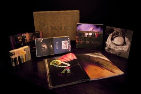
Iconic graphic designer Vaughan Oliver has spent more than three decades creating beautifully weird, wonderful and influential work, helping reinvent the approach to record sleeve design. Perhaps most famous for his designs for record label 4AD’s bands such as the Pixies and Cocteau Twins, Oliver’s career has also spanned work with oddball director David Lynch, and projects in fashion, film, dance and fine art.
Ahead of his talk later this month, Visceral Pleasures: 30 years in 60 minutes, Design Week spoke to Oliver about his celebrated ambiguous style, the importance of collaboration, and the death of designing for record sleeves.
What will you talk about in the lecture?
My life and work - 30 years in 60 minutes! Collaborations I’ve made, the way I work - using ambiguity and mystery, and my ad-hoc, intuitive, iconoclastic approach to typography – i.e I don’t know what I’m doing.
Where did your interest in typography come from?
I studied graphic design but really wanted to be an illustrator. In the late 1970s before the boom of the 1980s I lived in Newcastle Upon Tyne and studied at the poly. I still didn’t know what graphic design really was but I wanted to do something in the area of music but hadn’t touched on typography. Back then I was ignorant of its potential, as I think it was taught a lot more drily. Nowadays the man on the street knows the word ‘font’. When I came out of college I was working designing packaging and drinks labels, and that introduced me to typography. I was obliged to use it do had to look more closely and study what was working. When I started making sleeves I started playing with big letters next to little letters and big, evocative mark-making – playing with that in different contexts and trying to respond to the imagery I already had.
How would you describe your work?
When I have to describe it for things like this [the talk] or an exhibition, I’d say it’s a slightly obscure an obtuse way of looking at things. I suppose I grew up in a period where the visual pun was prevalent in graphic design – a one-liner – but I enjoy things being a lot more open to interpretation, which is very useful working in areas like designing for music.
How did you first get involved with the record label 4AD?
I met a man called Ivo [Watts-Russell, joint-founder with Peter Kent of 4AD] – they were just two guys working in a studio. Ivo knew I wanted to work in that field, so I put my foot in the door and wouldn’t take it out. I used to bump into him at a lot of gigs and persuade him he needed things like logos and visual consistency.
So how did you approach designing sleeves and other music projects?
All that stuff was done with a lot of collaboration and collusion with the bands. With something like the Pixies, for example, the lyrics are full of images but I didn’t necessarily use those images directly - apart from Monkey Gone to Heaven - but I’d listen to it and discuss the themes with Charles [Thompson III, aka Black Francis, lead singer of The Pixies]
So how did the Pixies artwork evolve?
We had a mutual affection for Lynch films, and Charles liked the idea of male nudity on a record sleeve [an image of a bald man with a hairy back is shown in the Come on Pilgrim EP sleeve]. Incidentally there was male nudity on some of photographer Simon Larbalestier’s work I’d seen. I’d liked his work - he graduated from the RCA and the hairy man was on the wall at his show. A lot of the images I use are pre-existing – I see a lot of photographers’ and students’ work and think ‘oh that’s good’ – but I’m not working on anything that sounds like that. Then you hear something it would be perfect for – but that might be four years later. I’m a very demonstrative art director. Half the job’s done when you’ve chosen the right photographer and made the link between his work and the record. It’s very rare that I’d stand over their shoulder.
Have there been any pieces that are personal highlights in your career?
Probably the Doolittle [Pixies 1989 album] artwork. It’s not about my work though – it’s about people being affected in their formative years but the power of music and graphic design together: when it works, it’s a fabulous thing. People have said they got into graphic design because of [Doolittle] – but it’s about hitting people in their formative years with that combination. It’s not about big clients.
4AD is the music I’d have bought – it wasn’t just a record company to me, it was like putting sleeves on my own records. Back then it was part of the culture- I’d be talking about the sleeve with the band in the day and going to their gig in the evening.
With most music downloaded and record sales dwindling, how has the field of designing for record sleeves changed?
I don’t think it’s great area for design at the moment – sleeves have become a niche market. The disappearance of the packaging has meant that the once the sleeve was a gateway to the music, but now record collections are a list of MP3s with no tangible reference points. I think it’s a shame it has become a niche market. Once it was much more demonstrative –everyone got the vinyl and had that pleasure, now its just for those who can find it or afford it.
What are you working on at the moment?
I’m doing some more work with David Lynch, and a new label coming out of Belgium, Brooklyn Bridge records…
What advice would you give to students trying to get into graphic design now?
Work hard – find your own voice, for fuck’s sake don’t follow trends. Lots of people want to work in the way others do - they don’t realise the market will die. Be inquisitive and curious and don’t settle for something easy. Keep on pushing.
Vaughan Oliver receiving his honorary Masters degree from UCA in 2011
Tuesday, 18 September 2012
Do Not Approach if Encountered!
Getting to know you...
Getting to like you,
Getting to hope you like me...
Come on now, sing along!
Our new new students get to know each other, before singing about it all.
Monday, 17 September 2012
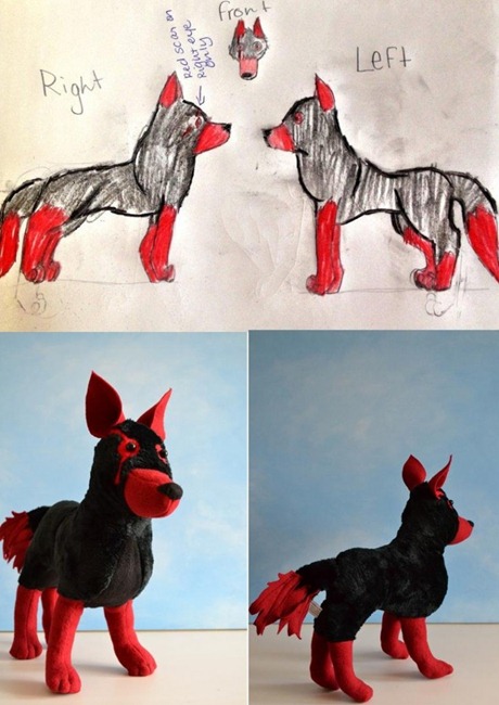
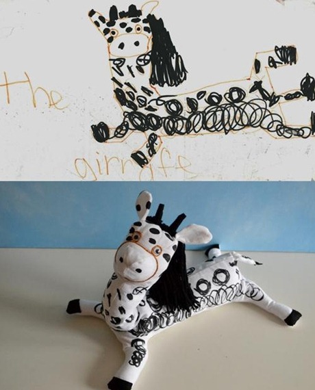
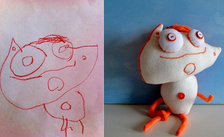
Child’s own
We all know kids do the best drawings. Fact.
Now they do the best toys too, thanks to Childs Own Studio
Thursday, 13 September 2012
Sir Bradley Wiggins - the Carlisle Connection
Sir Brad has been supplied with his sideburns by this Cumbrian retailer since his teenage years and they must rank as his most faithful and long-serving sponsors.
Initially crafted from Fuzzy Felt and attached by means of double sided tape, Sir Brad's burns have certainly moved with the times. Under the supervision of cycling supremo David 'Dave' Brailsford, these iconic attachments are now as high tech as any other piece of cycle racing equipment. Wind tunnel tested, they are crafted from an aerodynamically efficient plush velour (Aeroplush™) and are held in place by quick release velcro.
Since winning the Tour de France, eagle-eyed cycling fans may have noticed a distinct change of colour on Sir Wiggo's cheeks. This is because in celebration of his outstanding victory, Sir Bradley's sideburns are now exclusively fashioned from a specially created new colour, race leader's yellow.
A fitting tribute to a true hero and a great champion. Well done Sir Bradley, Grillust™ salutes you.
 Shortly before the start of the Carlisle leg of The Tour of Britain, a clean-shaven Sir Bradley waits nervously for the delivery of his iconic trademarks.
 With minutes to go, a sheet of Aeroplush™ is hand delivered by his proud sponsors. Sir Brad breathes a sigh of relief...
 Custom-cut by Dave Brailsford on the Team Sky bus (using round-nosed safety scissors) our hero emerges fully dressed and ready to take on the challenges of another day on the road.
Sir Bradley passes the emporium of his faithful Carlisle sponsor as the peloton waves goodbye to The Great Border City.
Wednesday, 12 September 2012
Grillust™ Supremo Enters the Tour of Britain
You may think the Captain must have been in training for weeks, but nothing could be further from the truth, This was very much a spur of the moment decision, taken at 9am this morning on the back of a liquid fuelled night of 'socialising'.
With the decision made the Grillust™ team quickly snapped into action to support the Captain in his desire to take on the might of such teams as Sky and Orica Greenedge.
Simon's cycle was speedily serviced (we pumped up the rear tyre), liniment (well actually lard from the canteen) was massaged into his recently waxed legs and he was good to go. It was only at this point that it occurred to us that the carbohydrate content of pale ale is relatively low and if he wanted to stand any chance of wresting the King of the Mountains jersey from Kristian House (let alone taking on 'Cav' in a bunch sprint) carbs would have to be consumed quickly.
Speedily, a sponsorship deal, involving pastries and fondant fancies was successfully arranged with Greggs the Bakers. Ten sausage rolls and a Chelsea bun later, we were ready for the 11am start.
The Captain was content to stay with the peloton as it rolled out of Carlisle but soon after decided to form a breakaway of one.
As our leader crested Shap Fell (426M) he was ten minutes clear of the pack with a tail wind and a downhill route to the finishing line on Blackpool promenade. Tragically for Grillust's cycling ambition the Captain (whose sense of direction is legend around these parts) was under the impression that the final destination of the race was Blackburn.
At 2.35pm Mark Cavendish crossed the finishing line at a famous seaside resort, cheered on by an enthusiastic crowd. At approximately the same time a solitary figure on a pink bicycle cycled up the main street of a large, Pennine, mill town, much to the indifference of the locals, and came to a halt in front of a well known bakers...
History (as they say) is always written by the victor.
 Happily ensconced in the peloton, the Captain negotiates Castle Way before making an early breakaway
 The Captain was happy to fulfil his sponsorship requirements before the race...
 Serviced and ready to go, the Captains 'mount' shortly before the start, alongside competitor's machines
Instaguerreotype!
Where Instagram provides instant nostalgia simply with colour, the vastly more powerful algorithms powering Instaguerreotype! provide 'decade-aware' remastering of the entire image. See these images of Sir Bradley Wiggins taken only this morning in Carlisle on Tour-of-Britain Stage 4.
Note how nearly all traces of modern life have been automatically removed to bring those nostalgic memories flooding back; the golden age the transatlantic liners... silent movies... prohibition... jumpers for goal posts... ration books... a life of grinding, menial service... rickets...


