

Tuesday, 16 October 2012
WILL RIO DO IT BETTER?
We might have witnessed one of the best Olympic games ever this summer in London - and proved that Britain really can put on a fantastically successful event - but one aspect let us down. That logo and that typeface! Grillust operatives had to bow our heads in shame every time we saw such a miserable offering representing the output of our profession. So what will Rio be putting before us in 2016? Here's a sneak preview of their Olympic typeface taking shape - not only a lesson in producing something much more elegant but also just how much effort and time is spent refining what most people think of as just another set of 26 characters...Click on this photo to read all about Rio's new typeface being developed.

Monday, 15 October 2012
google doodle

Google ‘doodles’ pop up on the search engine’s page from time to time and this one, celebrating American illustrator and animator, Winsor McCay has got to be one of the best they’ve ever done. For info on the background of the artist head here
Friday, 12 October 2012
Band names (part 7)
Just the latest in our series for emerging bands struggling to find an appropriate 'handle'...
Name: Abandon the Grouse
Genre: Retro-New-Romantic
Debut Single: Born to be Shot
Name: The Dangling Connotations
Genre: Crusty Folk-Rock
Debut Single: Prosthetic Limb Festival
Name: Ghost of a Rectangle
Genre: Geometric Prog
Debut Single: Galadriel's Geometry Set
Name: There's Nothing Digital About the Next Two Weeks
Genre: Dub Accordion
Debut Single: Jimmy Shand knew my mother
Name: The Inconsistent Indents
Genre: Barber's Shop Quartet
Debut Single: Two Hyphens in One Short ParagraphWednesday, 10 October 2012
Grid me up!
Following on from their intuitive layouts, second year students spent last week exploring a number of alternative grid structures in editorial layout. Part of the project was aimed at revisiting editorial and typographic conventions as well as the mechanics of InDesign; but the real trick was not to let the perceived constraints of working with grids from adversely affecting the impact of the spreads.
Here are some of the many visual opportunities the students discovered in their grid structures...


Here are some of the many visual opportunities the students discovered in their grid structures...

The Freezer Defrosts: splash spread by Dominic Tunstall (21)


Being Wiggo: splash and turn spreads by Ami Swift (21)

The Freezer Defrosts: splash and turn spreads by Sam Kallagher (21)
.
Tuesday, 9 October 2012
First Years, First Project
Our intrepid new Year 1 students have just finished their very first project. They were given two weeks to produce an ISSUU publication that captured the spirit of a chosen location.
Sounds an easy enough task, doesn't it? Well, it's not!
The point we wanted to get across right from the start is that engaging design and illustration are all about having personal thoughts and opinions about your subject matter and then clearly identifying what you want to say about it.
This is probably the most difficult aspect of design that any student has to face as it requires both bravery and confidence.
Have a look for yourself below...
Kate Patterson, Reece Crowder & Abigail Pearson (all 21) take an anthropological approach to a local bus stop
Lucy Hadley & Kate Budniak (both 21) spent time at Carlisle railway station
Connor Palamino & Kianna Poskitt
(strangely enough, also both 21) attended an open mic night at one of Carlisle's many fashionable cafe-bars
Sophia Linley (21) also went to the park
(but didn't do anything that rhymed)
Cameron Holland, Jessica Heaps & Abigail Johnston (21, 21 and 21) spent time in Carlisle's largest secondhand bookshop
Sophie Driffield (21) and Jenny Read (also, also 21) have been hanging around in a back alley...
This is just a small selection. You can see many more goodies here.
Monday, 8 October 2012
Monographs
Our eager and talented 3rd year graphic designers and illustrators have just finished their first project after the summer vacation. Asked to respond to a given word and produce a printed monograph, they approached the project in their usual inventive and exploratory manner. Here are just some of the highlights from a really varied, creative and carefully produced set of projects...
It's going to be an great year :-)


It's going to be an great year :-)


 |
| Yvette Earl (21) |

 |
| Megan Steen (21) |

 |
| Stephanie Stilwell (21) |

 |
| Ben Walton (21) |
Thursday, 4 October 2012
IT'S OFFICIAL* WE'RE 100%* STIMULATING!
*From the 2012 National Student Survey (NSS)
Staff have made the subject interesting: 97% agree
Staff are enthusiastic about what they are teaching: 97% agree
The course is intellectually stimulating: 100% agree
Of course, we consider ourselves fortunate in that we have "100% stimulating" students to work with day-to-day; and that just spurs us on to do our very best for them.
Staff have made the subject interesting: 97% agree
Staff are enthusiastic about what they are teaching: 97% agree
The course is intellectually stimulating: 100% agree
Of course, we consider ourselves fortunate in that we have "100% stimulating" students to work with day-to-day; and that just spurs us on to do our very best for them.
 |
| Pleased? Here's a 100% stimulating Grillust™grin. |
Wednesday, 3 October 2012
Tuesday, 2 October 2012
Great Website for the Retro Curious with a Head for Heights
Ever wondered what your hometown looked like in the past, but from above? We know we have...
Now a fantastic website has come along that can satisfy our yearnings for a precipitous perspective on our past. Britain From Above contains over 16,000 images of 'Britain from above' taken between 1925 and 1953 (the year black and white aerial photography was finally banned).
Now a fantastic website has come along that can satisfy our yearnings for a precipitous perspective on our past. Britain From Above contains over 16,000 images of 'Britain from above' taken between 1925 and 1953 (the year black and white aerial photography was finally banned).

Carlisle (home to the Grillust™empire) is well represented in a series of photographs taken in 1925 from the passenger seat of Virgin Airlines' very first aircraft; an ex-W.W.1 Vickers Vimy (with one careful owner).
Way back then, we worked out of a mill building in the city centre and used a slightly different logo (see the photo of our eye-catching roof stencil above) but the staff (pictured below in 1925) have hardly changed at all in the intervening years.

Monday, 1 October 2012
2nd year intuition
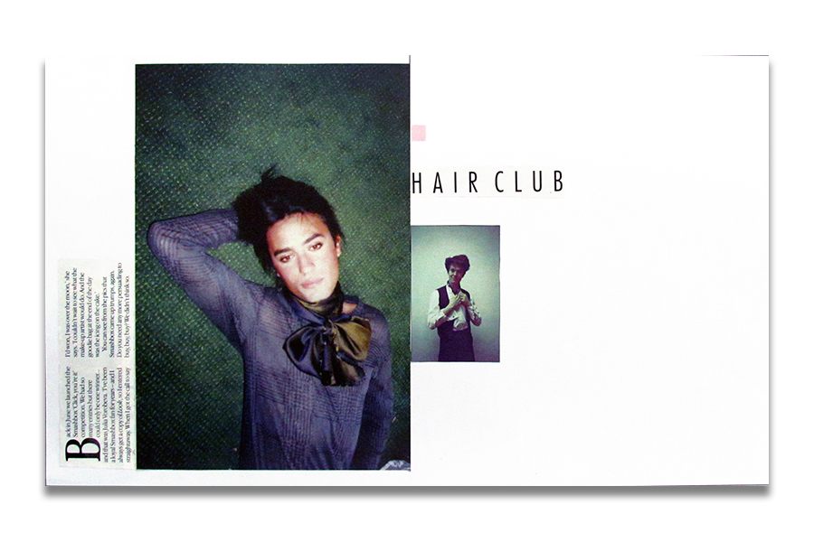
The super keen second year graphic designers and illustrators kicked off the new academic year by each producing a whole raft of intuitive layouts last week. There were lots of little rules to follow but the trick, of course, was to manage copy, image and negative-space to create spreads with attention-grabbing impact!
Here are just some selected highlights...
Here are just some selected highlights...
 |
| Ruth Fogden (21) |
 |
| Yvonne Kennedy (21) |
 |
| Mike Mann (21) |
 |
| Adam Norfolk (21) |
 |
| Josh Robey (21) |
 |
| Jenn Sproat (21) |
 |
| Jasper van Looveren-Baines (21) |
 |
| Rachael Ellis (21) |
Friday, 28 September 2012
Wednesday, 26 September 2012
Rickerby Park with Ducks

Still, it's turned out nice today...
Friday, 21 September 2012
Wednesday, 19 September 2012
grillust hero Vaughan Oliver on Visceral Pleasures
article copied from

Iconic graphic designer Vaughan Oliver has spent more than three decades creating beautifully weird, wonderful and influential work, helping reinvent the approach to record sleeve design. Perhaps most famous for his designs for record label 4AD’s bands such as the Pixies and Cocteau Twins, Oliver’s career has also spanned work with oddball director David Lynch, and projects in fashion, film, dance and fine art.

Ahead of his talk later this month, Visceral Pleasures: 30 years in 60 minutes, Design Week spoke to Oliver about his celebrated ambiguous style, the importance of collaboration, and the death of designing for record sleeves.
What will you talk about in the lecture?
My life and work - 30 years in 60 minutes! Collaborations I’ve made, the way I work - using ambiguity and mystery, and my ad-hoc, intuitive, iconoclastic approach to typography – i.e I don’t know what I’m doing.
Where did your interest in typography come from?
I studied graphic design but really wanted to be an illustrator. In the late 1970s before the boom of the 1980s I lived in Newcastle Upon Tyne and studied at the poly. I still didn’t know what graphic design really was but I wanted to do something in the area of music but hadn’t touched on typography. Back then I was ignorant of its potential, as I think it was taught a lot more drily. Nowadays the man on the street knows the word ‘font’. When I came out of college I was working designing packaging and drinks labels, and that introduced me to typography. I was obliged to use it do had to look more closely and study what was working. When I started making sleeves I started playing with big letters next to little letters and big, evocative mark-making – playing with that in different contexts and trying to respond to the imagery I already had.
How would you describe your work?
When I have to describe it for things like this [the talk] or an exhibition, I’d say it’s a slightly obscure an obtuse way of looking at things. I suppose I grew up in a period where the visual pun was prevalent in graphic design – a one-liner – but I enjoy things being a lot more open to interpretation, which is very useful working in areas like designing for music.
How did you first get involved with the record label 4AD?
I met a man called Ivo [Watts-Russell, joint-founder with Peter Kent of 4AD] – they were just two guys working in a studio. Ivo knew I wanted to work in that field, so I put my foot in the door and wouldn’t take it out. I used to bump into him at a lot of gigs and persuade him he needed things like logos and visual consistency.
So how did you approach designing sleeves and other music projects?
All that stuff was done with a lot of collaboration and collusion with the bands. With something like the Pixies, for example, the lyrics are full of images but I didn’t necessarily use those images directly - apart from Monkey Gone to Heaven - but I’d listen to it and discuss the themes with Charles [Thompson III, aka Black Francis, lead singer of The Pixies]

So how did the Pixies artwork evolve?
We had a mutual affection for Lynch films, and Charles liked the idea of male nudity on a record sleeve [an image of a bald man with a hairy back is shown in the Come on Pilgrim EP sleeve]. Incidentally there was male nudity on some of photographer Simon Larbalestier’s work I’d seen. I’d liked his work - he graduated from the RCA and the hairy man was on the wall at his show. A lot of the images I use are pre-existing – I see a lot of photographers’ and students’ work and think ‘oh that’s good’ – but I’m not working on anything that sounds like that. Then you hear something it would be perfect for – but that might be four years later. I’m a very demonstrative art director. Half the job’s done when you’ve chosen the right photographer and made the link between his work and the record. It’s very rare that I’d stand over their shoulder.
Have there been any pieces that are personal highlights in your career?
Probably the Doolittle [Pixies 1989 album] artwork. It’s not about my work though – it’s about people being affected in their formative years but the power of music and graphic design together: when it works, it’s a fabulous thing. People have said they got into graphic design because of [Doolittle] – but it’s about hitting people in their formative years with that combination. It’s not about big clients.
4AD is the music I’d have bought – it wasn’t just a record company to me, it was like putting sleeves on my own records. Back then it was part of the culture- I’d be talking about the sleeve with the band in the day and going to their gig in the evening.
With most music downloaded and record sales dwindling, how has the field of designing for record sleeves changed?
I don’t think it’s great area for design at the moment – sleeves have become a niche market. The disappearance of the packaging has meant that the once the sleeve was a gateway to the music, but now record collections are a list of MP3s with no tangible reference points. I think it’s a shame it has become a niche market. Once it was much more demonstrative –everyone got the vinyl and had that pleasure, now its just for those who can find it or afford it.
What are you working on at the moment?
I’m doing some more work with David Lynch, and a new label coming out of Belgium, Brooklyn Bridge records…
What advice would you give to students trying to get into graphic design now?
Work hard – find your own voice, for fuck’s sake don’t follow trends. Lots of people want to work in the way others do - they don’t realise the market will die. Be inquisitive and curious and don’t settle for something easy. Keep on pushing.

Vaughan Oliver receiving his honorary Masters degree from UCA in 2011
Subscribe to:
Posts (Atom)
