

Monday, 7 October 2013
Iginio Lardani

Thursday, 19 September 2013
every film poster Saul Bass designed
Do you want to see every film poster that Saul Bass designed?
(And just to be clear, yes, yes you do).
Then follow this link


Friday, 13 September 2013
Tour of Britain. Again.
Monday the 16th of September is notable for two reasons. Firstly this years influx of Grillustites will arrive to begin their time at Grillust towers and secondly the tour of Britain will roll through the streets of Carlisle, once again.
As we all know, last years visit by the tour was marred, for one and all, when Grillust head honcho and pocket pugilist, Captain Simon Davies offered Bradley "Weller on Wheels" Wiggins, a taste of his knuckle sandwiches, with the battle cry "MY BIKE'S BETTER THAN YOURS AND IT'S GOT MORE GEARS".

The astounding claim appeared to be deflected by Wiggins' once trademark mutton chops but, unperturbed, Davies pursued the Olympic gold medal winner through the great city's historical streets, but was, on the day, unable to catch Wiggins; later claiming that a meat and veg pie, supplied by his main sponsor Greggs, had fallen and become mashed in the rear sprocket of his bike and was to blame for his slow pace.

Will Wiggins get away so lightly this year?
Will Simon's attempt be yet again thwarted by bad handling of quality baked goods?
To find out, we'll be in town on Monday morning to witness the great races stage 2 start where old rivalries may flare up once again. The race will begin at 10:45am in the main square (outside Topshop/man) but if you want to see grown men have their shaven legs rubbed down by other grown men or witness a bike chain being lubed with far too much care and attention - our advice would be to turn up early.
As we all know, last years visit by the tour was marred, for one and all, when Grillust head honcho and pocket pugilist, Captain Simon Davies offered Bradley "Weller on Wheels" Wiggins, a taste of his knuckle sandwiches, with the battle cry "MY BIKE'S BETTER THAN YOURS AND IT'S GOT MORE GEARS".
The astounding claim appeared to be deflected by Wiggins' once trademark mutton chops but, unperturbed, Davies pursued the Olympic gold medal winner through the great city's historical streets, but was, on the day, unable to catch Wiggins; later claiming that a meat and veg pie, supplied by his main sponsor Greggs, had fallen and become mashed in the rear sprocket of his bike and was to blame for his slow pace.
Will Wiggins get away so lightly this year?
Will Simon's attempt be yet again thwarted by bad handling of quality baked goods?
To find out, we'll be in town on Monday morning to witness the great races stage 2 start where old rivalries may flare up once again. The race will begin at 10:45am in the main square (outside Topshop/man) but if you want to see grown men have their shaven legs rubbed down by other grown men or witness a bike chain being lubed with far too much care and attention - our advice would be to turn up early.
The Lakes International Comic Art Festival
Exciting news for all comic fans!


Just a heads-up about the forthcoming 'Lakes International Comic Art Festival' in Kendal (Cumbria) in mid-October which looks really exciting and has an amazing roster of artists including; Steve Bell, Joe Sacco, David Lloyd (V for Vendetta), Stephen Collins (weekend Guardian), Carlos Ezquerra (early 2000AD - one of my personal faves), Jose Munoz (likewise), Gilbert Shelton (The Fabulous Furry Freak Brothers), Posy Simmonds and a lot more . . .
Click here for more information.

We will have a stand at the event (as The University of Cumbria Comic Book Collective) and will be launching issue four of our very own 'Bagatelle', a magazine devoted to student created sequential art. Here's a sneak preview of the cover designed by Year 3 Illustration student Robert Marshall (21).


Friday, 6 September 2013
Hello?.. Testing... One Two, One Two. Let's Dance!
Hello folks, the summer's over, adventures have been had and it's time to get the Grillust™ Blog up and running again.
As it's a Friday we thought we'd kick off with a few rip-roaring 'Friday Songs'.
You probably already know how much the Grillust™ Team love contemporary dance. We often use it as part of the assessment process and with that in mind, here are four popular music videos featuring some Grillust™ approved choreography...
As it's a Friday we thought we'd kick off with a few rip-roaring 'Friday Songs'.
You probably already know how much the Grillust™ Team love contemporary dance. We often use it as part of the assessment process and with that in mind, here are four popular music videos featuring some Grillust™ approved choreography...
Thursday, 18 July 2013
SAGMEISTER SPEAKS
"When you create something original you give birth to an idea and then nurture that idea until it’s mature enough to send into the world. If you copy someone else, you’re depriving yourself of the amazing feeling of creation, of making something that is yours and yours alone. You’ll undoubtedly love and care for the baby you’ve created more than the baby you stole from the grocery store."
—Stefan Sagmeister
Wednesday, 10 July 2013
Good Advice

Gregory Manchess is an American illustrator in the traditional sense. Take a look at his site here and his biography here and understand that he's a man to be listened to. He knows his onions.
Mr Manchess recently posted on the rather good "Muddy Colours" Blog where he gave these tips on book cover illustration - advice that can quite as easily be extended to cover many aspects of this wonderful world of illustration.
After years of painting book covers, and loving every part of that aspect of illustration, I've collected a few thoughts to keep in mind when working to give a book the best possible cover to attract a buyer.
My job as the cover artist is to fascinate the potential buyer. To draw them in, and keep them there.
There are many 'don'ts' on this list, but just as many 'do's'. Always strive for the best work you've ever done for a cover. It pays off in more work, and a reputation you can bank.
1. Entice the buyer.
Your job as the cover artist is to get the potential buyer to pick up the book. Once it’s in their hands, the writer takes over. But you have to support the writer with your imagery. Be authentic to the story, but do not over-complicate things. The writer has enough on their plate. You can help by keeping it intriguing.
2. Set a mood .
Setting a mood for the book is better than explaining what’s in the book. Again, show, don’t tell. Stay away from complex images that try to explain what the book is all about. That’s the writer’s job. You set the mood for the characters to live in. You introduce the world they inhabit. That's far and away more interesting.
3. Do not describe a scene .
You will not be able to get inside a reader’s head. Again, the writer does that. As the artist, you’ll only be showing a scene the way you, as a visual story-teller, will see it.
You are more advanced than the writer at showing imagery. Your picture is not an excuse for a lack of 1000 words. Language is limited. What the writer describes in words is never quite enough to complete the image. That’s why the writing has such power. Writers allow us to complete the image in our minds. You, the artist, must be able to do both: give information while allowing the viewer to finish it in their heads...and do it very well.
I have yet to find a writer who has the graphic depth and experience to design fictional clothes with appropriate color balance, or design architecture, spaceships, or lighting. The artist must interpret and finesse the author's impressions.
Everyone pictures a scene differently, especially the writer. We all interpret what they mean. You will never get it exactly right. If a writer says you've nailed it, then smile and say thanks. You just got lucky.
4. Do not reveal or solve a mystery .
If you get a mystery or thriller cover assignment to illustrate, then no matter what: do not reveal the mystery on the cover. Don’t even hint at the answer as you will kill the reveal. And that’s what the reader pays for. The reveal. Keep it as mysterious on the outside as on the inside. The writer will love you for that.
5. Graphic interest.
Keep it simple. Repeat: keep it simple. You cannot get the reader to understand some subtle, psychological attitude without destroying the impact of a striking, simple cover. Simplicity stays compelling. Complexity confuses at first, and when understood, loses graphic impact.
6. Strong figures .
Every figure on a cover must be visually pleasing. No, I don’t mean sexually appealing. I mean that the viewer must instantly feel that the figure is ‘right.’ Even if it’s distorted, the figure must feel good to the viewer. Balance is appealing.
7. Do not paint the turning point of the story.
Do they show the best part of a film in a movie poster? (ok....don’t answer that--Hollywood is remarkable at destroying fabulous moments by putting them in the dang trailer....and we never forget we've seen it...) Do you buy a book hoping to understand it by looking at the cover? Do you want the turning points pictured on the cover before you’ve let the writer have a chance to build toward that special moment?
Story is process. Do not take a writer’s power from them (or let the ignorant writer demand that you do). They know how to tell the tale in sequence. Don’t destroy their labor.
Besides that, turning points of story are usually dull without set-up. And visually boring.
8. Set up the world that the writer makes exciting .
Create a setting where the characters can live, or contrive a visual conflict between characters within the setting that can enhance the mood of the story, and cause a potential buyer to be curious. Curiosity sells books. Mysteries-promised-to-be-solved sells books.
NC Wyeth was particularly excellent at building a painting from the material involved. It was not necessarily something directly out of the book, but it always gave a fresh perspective that drove interest back to the story.
9. Keep the reader returning to the book.
You do this by making the imagery simple and direct enough to create a sense of questioning, of curiosity, that entices the reader back to the story. A good, solid cover can cause a reader that’s slogging through a long book to come back over and over again. The writer will love you for that. Or should anyway. An aware publisher/art director/author won't ask you to explain everything in one scene.
10. The cover is not a short film.
Some art directors and many publishers will tell you how much stuff happens in a scene that they want you to put on the cover. It’s ridiculously complicated. It’s enough to flesh out a small animation.
YOU HAVE BARELY ONE SECOND to capture the imagination of the potential buyer. It’s like looking at a website. Images load too long? They click away.
Paintings do not have enough time to explain this conflict: that she loves him, but she can’t tell him because that would ruin their friendship, since he’s already married, but his wife is terminally ill, and waiting for him won’t work because he’s on his way across the sea to fight in the.....
Nope, I don’t think so.
Bang: two people in a garden setting, she’s holding his hands within hers. We only know what we see. Later the writer brings us to this point, through set-up, and when we look at the cover again, as the reader, we understand what it's about. Then it has staying power. Impact.
To repeat: it should not be the turning point. Let the writer have that glory.
11. Both artist and author work in tandem.
Let the writer have their day in the sun. It started with them. You are there to make them shine. You are there to allow the publisher the easiest path possible to multiple sales.
“They pick it up because of the cover. They put it down because of the author,” is an old saying, but I prefer to think of it this way: “They pick it up because of the artist, they keep it because of the author.”
The artist is the author’s wing-man. You’ve got their six.
- hard earned understanding from many years as an artist indemand. Ignore at your peril.
Tuesday, 9 July 2013
Grillust™ Joins The Freemasons!
The Freemasons have recently been on a national 'charm offensive' looking to recruit new members to their secret, ritual obsessed organisation.
In Carlisle this marketing campaign manifested itself as an exhibition at the city museum & art gallery, Tullie House.
Three of the Grillust™ team, Zoe, Tony and Dwayne (all charismatic, all 33) went along to find out what the fuss was about...
We're not at liberty to divulge what exactly went on at the exhibition, but we can tell you that Carlisle now has a brand new Masonic Lodge to add to the fourteen (yes, we couldn't believe it either) that already existed.
Grillust™ Lodge No.2391 currently has three members pictured below:
 From left to right: Tony Peart (Tyler), Zoe Garnett-Scott (Grand Master) and Dwayne Bell (Junior Warden)
The rest of the Grillust™ team are dying to know what goes on at the Grillust™ Lodge meetings (apart from wearing pinnies, eating Terry's Chocolate Orange and walking with a limp) but as we are a secret organisation we have sworn a solemn oath never to reveal the true nature of the ancient 'craft'.
Besides, if they found out, we would probably be ridiculed for the rest of our days.
In Carlisle this marketing campaign manifested itself as an exhibition at the city museum & art gallery, Tullie House.
Three of the Grillust™ team, Zoe, Tony and Dwayne (all charismatic, all 33) went along to find out what the fuss was about...
We're not at liberty to divulge what exactly went on at the exhibition, but we can tell you that Carlisle now has a brand new Masonic Lodge to add to the fourteen (yes, we couldn't believe it either) that already existed.
Grillust™ Lodge No.2391 currently has three members pictured below:
From left to right: Tony Peart (Tyler), Zoe Garnett-Scott (Grand Master) and Dwayne Bell (Junior Warden)The rest of the Grillust™ team are dying to know what goes on at the Grillust™ Lodge meetings (apart from wearing pinnies, eating Terry's Chocolate Orange and walking with a limp) but as we are a secret organisation we have sworn a solemn oath never to reveal the true nature of the ancient 'craft'.
Besides, if they found out, we would probably be ridiculed for the rest of our days.
New Blood 2013
 Here's the report we promised earlier on D&AD's New Blood graduate showcase event in London's über trendy Spitalfields Market.
 Our students had a very busy three days with industry professionals enthusing about them and their work. Mr James Bradley (21) was offered a job with a well known Leeds/London branding agency, but had to politely turn them down as he's already got a job with LBi in Edinburgh.
Charismatic Robert Marshall (21) was regularly approached by strangers over the three days (no, not in that way) after having been singled out by Digital Arts Magazine as 'one to watch'.
Lots of positive contacts were made and we'll be keeping our fingers crossed over the coming weeks.

As usual, the highly efficient Typographer Royal, Rhiannon Robinson (33) had our stand set up within minutes, ably assisted by James Bradley 6'1", Mark Collins 6'1", Steph Stilwell 5'8" and Rach Garry 5'4". James and Mark were assigned responsibility for the loftier regions of the stand...
Here's the finished stand beautifully modelled by Rhiannon and The Duchess of Cockermouth, Zoe Garnett-Scott (33).

Meanwhile, outside the calm environs of our stand chaos reigned...
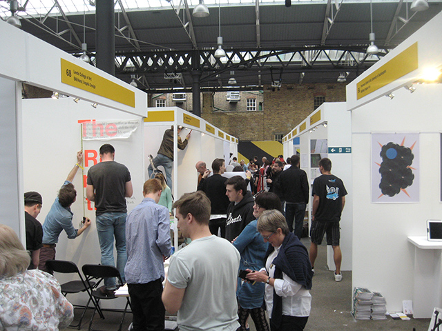
Here's all the gang on the 'industry only' private view night (which was very well attended...)

Illustrator Yvette Earl (21) admires Rach Gary's (21) miniature woolen hat promotional cards (knitted by mum).
As you can see from the photo, Rach likes to sport a good woolen hat, irrespective of the season and it has become something of a trademark. In fact, none of us has ever seen Rach without her hat. Does she ever take it off? Does it hide a bald patch? We'll probably never know...

There was plenty of free booze as evidenced below:


The event was very friendly with lots of mutual admiration going on between the exhibiting students.
Here's our very own Jade Wall (21) showing her work to Falmouth (Cornwall) illustration student Martha Anne (21). Coincidentally, Jade actually comes from Cornwall, Newquay to be precise, but being allergic to surf and loving the mountains, chose to study with us in far away Cumbria.

Brace yourselves! Pictured below is the shocking downside to social networking. These four were 'forced' to Tweet and Blog non-stop about what a 'fantastic time' they were having (fantastic time not pictured).

Day two: reinforcements arrive! 'Man of the North' Dwayne Bell (33) strides onto the stand followed by our leader, Captain Simon Davies (33).

D&AD gave the exhibitors a little more room this year which was very welcome. Here's the show as seen by one of the many passing pigeons.

On our way to the show we stumbled across a fantastic little fabric shop stocking these spiffing Dutch wax prints, designed for the West African market.

How could we resist. We (mostly) all bought some and will have them made into shirts (Zoe) and evening dresses (Simon & Tony).

Only our token non metro-sexual Illustration tutor Dwayne Bell pretended not to be interested (he was but couldn't bring himself to admit it)!

All in all, a great time was had.
Monday, 8 July 2013
FEELING GOOD :-)
You might remember that one of last year's super-star Grillust™ graduates, Rachy McKenzie (33), was a worthy winner in the 2012 YCN design briefs, with some juicy typography she created for a Feel Good drinks campaign.
The fruity folk at Feel Good liked her approach that much, they've been working with Rachy over the past year to develop the campaign which is now live across the UK...

Rachy McKenzie. 100% Natural Born Grillust™
The fruity folk at Feel Good liked her approach that much, they've been working with Rachy over the past year to develop the campaign which is now live across the UK...

Rachy McKenzie. 100% Natural Born Grillust™
Wednesday, 26 June 2013
London Calling

It's that time of year again to pack our rucksacks, don comfortable footwear and head for that there London (a large town in the Southeast of England). Yes folks it's New Blood time!
Every year over 70 institutions exhibit at this prestigious D&AD graduate showcase in London's East End. You can find out more about it here.
New Blood a fantastic opportunity for our students to wow industry professionals with their talent, skill and, most importantly, lovely personalities. Each year many of our students gain jobs as a direct result of attending.
 Here's Grillust's very own 'Barefoot Contessa' (H.R.H. Rhiannon Robinson) inspecting the banners for our New Blood exhibition stand
New Blood isn't just open to industry professionals, anyone can come along and it's free too!
Old Spitalfields Market
Brushfield Street
Spitalfields
E1 6AA
Wednesday 3 July 2013 & Thursday 4 July 2013
Opening hours: 09:30AM – 20:00PM
Grillust operatives: Rhiannon, Zoe & Tony will be on the stand on Wednesday and Simon, Jim and Dwayne on Thursday.
So, to all of Grillust's friends old and new, if you can make it, please do come along as it will be lovely to see you.
Thursday, 13 June 2013
Grillust™ Summer Show 2103 Website...
Catch up with you favourite Grillustiando's here

...and don't forget, we'll be in London at the New Blood exhibition at Spitalfields, 2–5 July 2013.
...and don't forget, we'll be in London at the New Blood exhibition at Spitalfields, 2–5 July 2013.
Tuesday, 4 June 2013

Monday, 3 June 2013
The Summer Exhibition - Eveyone's Invited!
The Summer Exhibition opens at 10.00am on Wednesday 5th of June and runs through to Wednesday 12th of June.
The Private View will be held this coming Saturday (8th June) between 6.00pm - 8.00pm and you're all invited.

Exhibition publicity designed by Jade Wall (21) of Year 3 BA Illustration
There's also a University Open Day on Saturday 8th June, you can find details of how to book a place here.
The Private View will be held this coming Saturday (8th June) between 6.00pm - 8.00pm and you're all invited.
Exhibition publicity designed by Jade Wall (21) of Year 3 BA Illustration
There's also a University Open Day on Saturday 8th June, you can find details of how to book a place here.
Puff Jim’s Guide to Hip Hop (Part 1)

Puff Jim - He knows da score
Yo! Blood.
I was chillin’ the other day when my homies on the Grillust™ Team said to me, they said; “Puff Jim, you know all about the modern Hippity Hop music ‘n’ stuff. Why don’t you write a post for our blog about the true origins of the music genre you love so much? This will both entertain ‘n’ inform da liddle chilren who are too young to remember the pioneers of the old, old skool from way back when. ”
It struck me there was truth in their words. The young bloods in my hood are hep to contemporary phat artistes like: Snoop Doggedy Dog; M&M’s; Jay Zed; Infamous Smallie Bigs; Dr. Dreyfuss and Bobby Beats but few have got game for da old skool stars like: Vanilla Ice; Threepack Smith and Africa Boombox Battery.
In fact even those in da know believe Hippety Hop was invented in da ghetto during da 1970’s. Well, I can tell them they don’t kno' nutin’!!
Word up! Here’s the true that history of old, old school Hippety Hop...
From its earliest days Hippety Hop was the music of society outsiders with a love of hearing their own voice, an unswerving belief in the value of their own opinions and a flamboyant attitude towards personal dress. I’m talking of course about the ‘Pearly’ Kings and Queens of London’s East End.

Pearlies in da Shoreditch ghetto
The ability to spout meaningless inanities in rhyme to a jaunty beat was first developed by Mixmaster Reginald Dixon on the mean streets of Shoreditch in the late 1890’s. It was Mixmaster Dixon who had the genius idea of combining the verbiage of Cockney Rhyming Slang with some washboard beats to create the world’s first Hippety Hop hit, My Old Man Said Follow the Van (later covered so memorably by Pearl Carr and M.C. Teddy Johnson.)

Mixmaster Dixon with his honey, Ethel Big-Beats
The unique sound of ‘Pearly Rap’ (as it was known then) spread fast through London and on into the Home Counties. In no time at all the first true megastar of Hippety Hop arrived in the unlikely form of one Andre Romelle Young (or Tebay Services as he styled himself) who rather surprisingly came straight out of Compton (Surrey).
Sadly no images or recordings of Tebay Services remain but a thinly veiled ‘pastiche’ of the old, old school star was used as the basis for the character ‘Bert’ (played by the multi-talented Dick Van Dyke) in the magical musical Mary Poppins.
Those early days of Hippety Hop linger on today in words like ‘bling’. Nowadays this refers to ostentatious, sparkly jewellery (some think this may be a 'folk memory' of a fully ‘buttoned up’ Pearly King or Queen) but it actually derives directly from original Cockney Rhyming Slang.
‘Pearly King’ became shortened to simply ‘King’ before morphing over time to ‘Bling’ – a word that allowed for greater alliteration.
So there you have it, lawks-a-mercy gov, who'd a thought it; Hippety Hop is 100% Pearly!
Loverly jubbely...
Next Time: The History of Hippety Hop Part 2 – The Noel Coward Years.
Subscribe to:
Posts (Atom)
